In Karl Lorenzen’s Endangered Coral, creased, torn, and punctured paper is layered with vibrant color and delicate linework to reflect the endless transformations of the natural world. The series is part of a larger body of work called Earthworks: The Monumental in Miniature, which explores nature’s balance and the contemporary ecological crisis. We were drawn to the evocative organic forms of these works, as well as their subtle interplay of color and line, and we are thrilled to feature them in Issue 42.2.
Art editor Liz Blackford reached out to Karl to discuss this series.
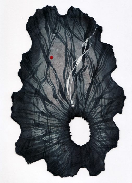
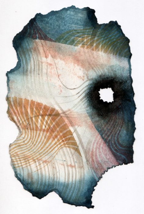
Coral Reef 7, 2017, Watercolor on torn paper, 5.25” X 8.5”
Liz Blackford: What drew you to coral as a subject matter?
Karl Lorenzen: In 2017 I began, what was for me, a new type of watercolor painting, where the paper is torn into an irregular shape, peeled, scraped, and punctured with holes. Images emerged from a process of pressing and smearing wet surfaces together. It was unlike the pictorial, carefully rendered work I had done previously. When the paintings were laid on the floor my wife pointed out that they resembled the coral reefs we had seen while helmet diving in Bermuda. So, in a way I was not drawn to coral as a subject matter, it was drawn to me: the paintings came first, then the concept.
After we had decided on Endangered Coral as the theme, I began to study and appreciate this highly diverse ecosystem. Corals are not plants, but tiny animals that anchor and aggregate to share resources. They form reefs that are home to at least a quarter of all marine species and provides ecosystem services to tourism, fisheries, and shoreline protection. They are under threat from climate change, overuse of reef resources, and harmful land use practices, both urban and agricultural.
The damage done to coral society reminds me of the harm brought to human society: destruction for the sake of profit and convenience. The diversity of color and form in a coral reef is inspiring, yet I want these paintings to work as painting without the backstory. I’m not illustrating marine life, but creating a symbolic equivalent.
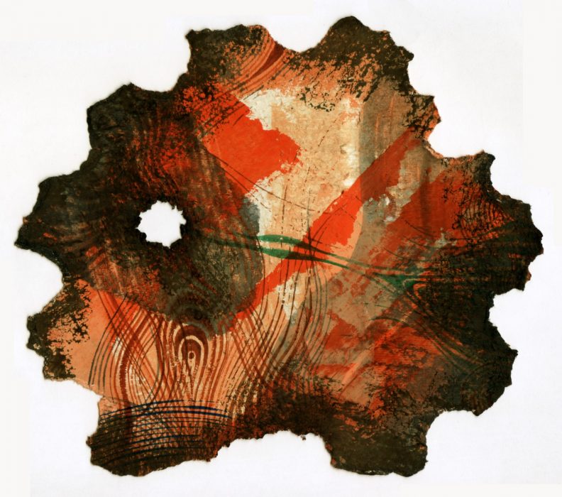
Coral Reef 8, 2017, Watercolor on torn paper, 7” X 8”
LB: You mentioned that this series is part of a larger body of work called Earthworks: The Monumental in Miniature. Could you tell us a bit more about the relationship between Endangered Coral and Earthworks?
KL: Endangered Coral grew out of Earthworks: they both reflect watercolor’s ability to record shifting states of existence. These small works on paper mirror nature’s endless transformations. The fragility of works on paper is a reminder of the delicate balance of natural forces we inhabit. With Endangered Coral I have become more aggressive in the use of materials, prompted by the current administration’s denial of global warming.
It’s inevitable that my work would reference marine life, since I live on a relatively underdeveloped barrier peninsula between ocean and bay. Due to past and recent economic and climactic occurrences, a number of areas have been abandoned and left to decay. With a public transportation lifestyle, I experience weather and terrain primarily on foot. I observe and internalize, then return to the studio, where the images reappear transformed as I improvise the next painting.
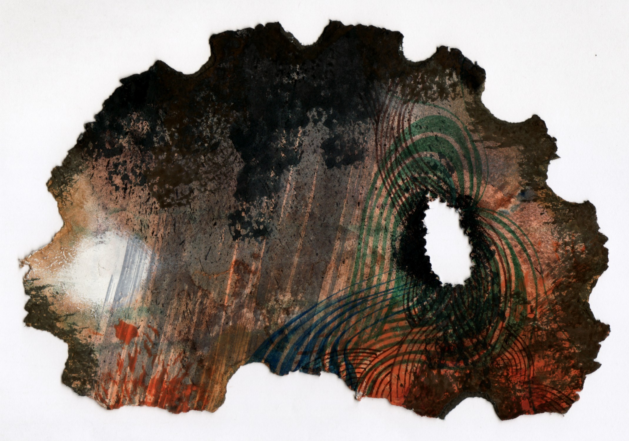 Coral Reef 14.2, 2017, Watercolor on torn paper, 5.5” X 7.5”
LB: I was intrigued by the varied colors in these paintings—there is an interesting tension between the delicate layers of translucent watercolor filling out the centers, and the dense blacks bleeding in from the edges, which almost makes the paper look singed. Could you talk about your use of color in these works?
KL: The dark edges are lamp or ebony black paint straight from the tube smeared with my finger. Black is the presence of all color, and the absence of light.
Sometimes I’ll start with a white piece of paper and lay down a wash of a single color. This becomes the dominant theme of the color story I create later. More often I wipe down an old painting and use the resulting patina (stain) as a point of departure.
Watercolor is about transparency: to maintain freshness and clarity, lay a light wash of red over yellow to create orange, and a light wash of blue over yellow to create green. Next comes the layering of “cool” colors (like blue) and “warm” colors (like red). Blue over red makes purple, and blue over yellow makes green. The history of watercolor is a series of endless variations on these rules of color theory. I follow or ignore the rules as it suits me.
Ultimately these works embody the traditional values of watercolor painting: evocative shapes, a balance of warm and cool colors, and the mysterious transparencies that make the medium so appealing.
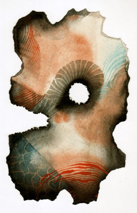
Coral Reef 1, 2017, Watercolor on torn paper, 5.25” X 8.5”
LB: You mentioned in your statement that the fragility of the medium you used here—diaphanous watercolor on creased, torn, and otherwise distressed paper—evokes the delicate balance between the natural forces in play around us and the ecological crisis humankind is creating in the world. Do you see this balance informing current conversations about art and nature?
KL: Art is the human response to nature: human intelligence selects from and frames the continuous flow of experience that might otherwise be overwhelming. Nature is beautified and savored through a safe window. This can induce boundary dissolving aesthetic experiences, or compartmentalized thinking, which perpetuates the ecological crisis – a conundrum that haunts the current conversations about art and nature.
Artworks that are delicate, distressed, and vulnerable evoke human sympathy, which makes an industry of archivers, curators, and restorers possible. We marvel at decrepit fragments and ruins that attain the status of collector’s items, yet plunder nature, which sustains us.
It no longer seems possible to fall into the lap of nature and hope everything will work out: there’s been too much damage and denial regarding earth’s finite resources. If nature is larger than human intelligence, then let’s welcome unanswered questions by learning from and cooperating with nature.
Coral Reef 3, 2017, Watercolor on torn paper, 5.25” X 8.5”
LB: You’ve done a lot of work in the field of sacred geometry, both as an artist and an educator. Could you talk a bit about your interest in sacred geometry? Does sacred geometry play a role in this series, or your artistic process in general?
KL: Sacred geometry, the confluence of art, science, and spirituality, constitutes a common ground between many of the world’s cultures and traditions. It is a language of number and symbol (circle, triangle, and square) that can be used to express profound ideas about the nature of existence, and the existence of nature.
I’ve internalized much of this material, so I’m able to play with it intuitively: my work is not the result of mathematical schemes. There are generative forms and laws operating behind appearances, which I use as recipes rather than rules. To me, sacred geometry is patterns of beauty, based on ratio and proportion, which is evident at every level of existence. Once you align with these patterns, you will see new things, and familiar things in a new way.
Karl Lorenzen is a professional artist who exhibits and teaches at cultural, educational, health, and holistic learning centers in New York City. He was a faculty member of the New York Open Center and Anthroposophy NYC, and he is a teaching Artist in Residence at the Omega Institute, NY. In 2016 and 2017, he received a SU-CASA Award/Residency, sponsored by the Queens Council on the Arts/New York City Department of Cultural Affairs.