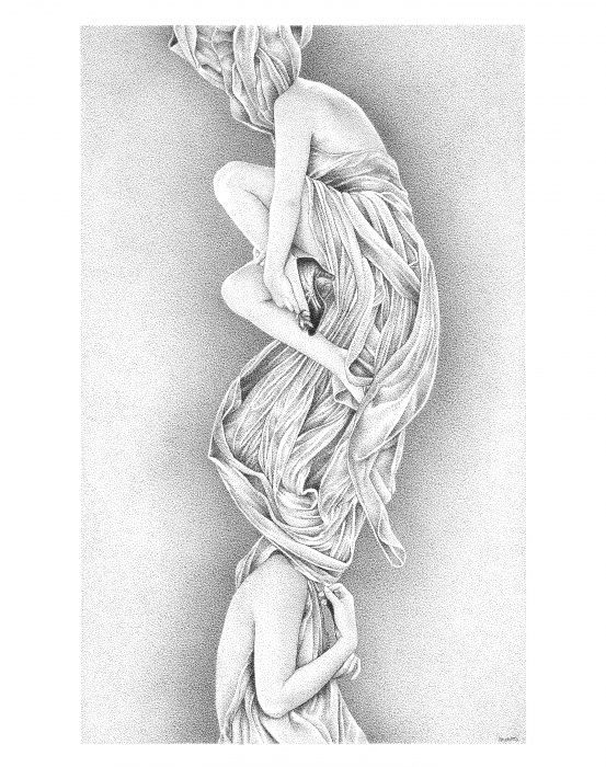
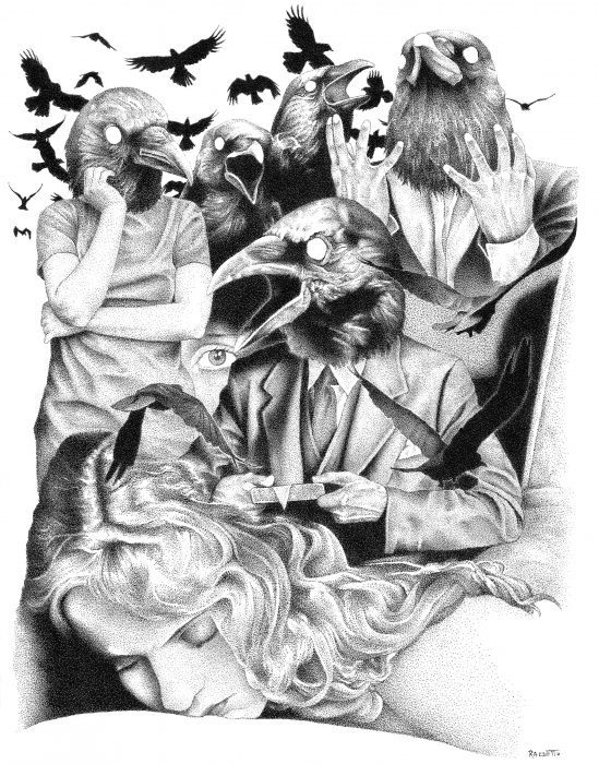
Renzo Razzetto’s stippled drawings combine fragmented imagery from a variety of sources into intuitive compositions that recall the free associations of dreams and the defamiliarization of poetry. We were intrigued by the evocative surrealism of these images, as well as by the painstaking illustration technique with which they are rendered. Art Editor Elizabeth Blackford reached out to Renzo to discuss his work and his process.
EB: I was struck by the way the near-photographic precision of these drawings is softened by the stippling technique you used to render them, giving the drawings an almost velvety surface texture. Could you tell us a bit more about this technique, and what drew you to it?
RR: Back when I started to get serious about illustrating, I remember trying different methods of inking. Shading using traditional line-based inking techniques made my illustrations look too rough. Needless to say, I wasn’t very satisfied with the results I was getting. Oddly enough, stippling was something that I just happened to fall in to. I mean, I really never studied it or recall ever reading about the process. When I started to put it into practice, it all seemed so natural, so instinctive, as if I had worked with this newfound technique before. And the best part was it gave me the results that I had longed for.
Photorealism was something that I had always strived for in my work. I’d always wanted my illustrations to have the look of an old photograph, so when I saw what stippling did to my work, I got hooked. I could, because of the nature of the technique, go from very light values to very dark ones in a very subtle way. It was exactly what I was looking for. As a self-taught artist, I initially thought that I should explore other techniques, but I just felt so comfortable stippling that I didn’t bother trying any other ways of working. All my focus shifted toward mastering this technique.
Stippling is a painstaking process. It requires you to be very dedicated, disciplined, but most importantly—and I can’t stress this enough—be extremely patient throughout the entire process. Illustrations can take weeks to finish. That’s why it also requires a lot of concentration. Every dot has to be in the precise spot. One dot in the wrong place could ruin the whole piece. There really is no room for error. I guess this goes well with the fact that I’m a bit of a perfectionist.
EB: You mentioned in your bio that your creative process is intuitive, which seems in keeping with the surrealist nature of your compositions. Could you tell us a bit more about what the composition process looks like for you?
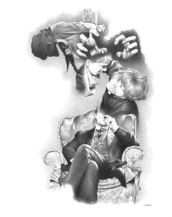
RR: I would have to start by saying that spontaneity is my main source of creativity. I let my intuition and subconscious guide me throughout the entire creative process. There have been times when I’ve started an illustration with some idea of what I want, just to throw that particular idea away and start all over again. For the me, that approach never really works. Sketching or drafting different ideas doesn’t really let me be very creative. I find that overly thinking an idea or concept really kills the creative process.
Clearing my mind of preconceived ideas and just letting the random images I come across guide me through the entire illustration is what I really enjoy about the whole process. It’s all a mystery to me when I start. Everything is left to chance. Nothing is planned. The images all of a sudden just start to relate to one another; they open up new realities, and they all come together to present a visual narrative full of strange pleasure and impromptu poetry.
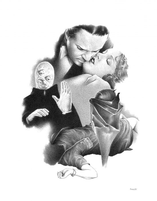
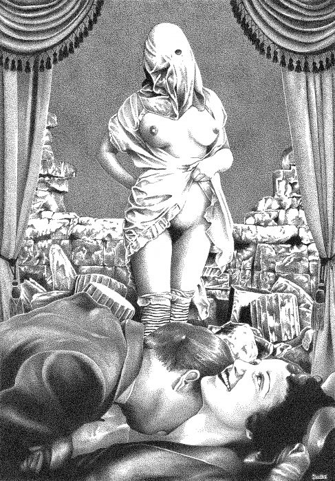
EB: Several of these drawings appear to incorporate imagery from early 20th-century cinema and classic horror—at least, I thought I spotted references to Alfred Hitchcock’s The Birds in Ominous Farewell, and a bit of Bela Lugosi’s Dracula in In the Presence of False Perception. Are there any particular themes you often return to in your work?
RR: Silent cinema as well as early horror films have greatly influenced my work. Even though I don’t set out to purposely create horror-themed illustrations, I have to agree that the dark themes usually associated with the horror genre always end up showing up in my work in some way.
German Expressionist cinema has also been a big influence on me and my work. The horror genre was heavily influenced by Expressionist films because of their dreamlike scenarios, distorted realities, and their use of light and shadow. All those are qualities that are also always present in my work. Themes related to the occult and eroticism have also been explored in some of my pieces.
EB: The titles of these drawings have a lyrical quality, and they seem to connect with the content of the images in a poetic way. How do you choose your titles?
RR: The process of choosing my titles is very similar to the way my illustrations are created. For example, after I complete a piece, I will go through various literary references and then start to randomly pick words or phrases that catch my eye. Then, much like the cut-up technique, I’ll write them down, combine them, and then choose a title that best accompanies the piece. For the most part, I tend to choose titles that don’t describe the pieces in great detail. Having a title that’s too descriptive would in a way influence the observer, and this I believe would take away from their interpretation of the work.
I find this method works extremely well with the type of work that I do, as it subconsciously expresses inner emotions and ideas through chance that in turn end up creating a fantastic, dreamlike reality.
EB: Are you currently working on any new projects you’d like to share with our readers?
RR: At the moment, I have a couple of book projects that are in very early stages of development. I wish I had some information to share with you, but it’s too early right now for any details. As soon as there are any updates, I will most gladly share them with everyone.
Renzo Razzetto is a self-taught illustrator that uses the pen and ink stippling technique to create collage-style illustrations which are solely created by intuition. His work has been exhibited across the US and featured in publications throughout the US and Europe. More of his work can be found at renzorazzetto.tumblr.com